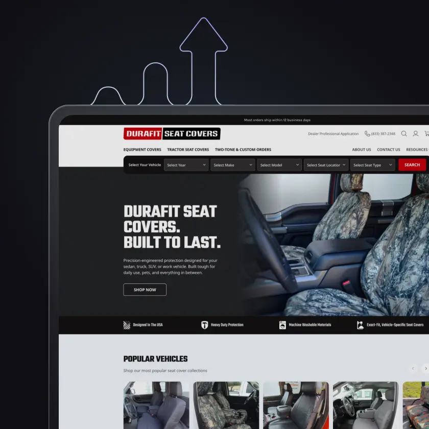
Redesigned their BigCommerce homepage and navigation. The update improves clarity, strengthens trust signals, and guides users directly into the vehicle selection flow without requiring a full site rebuild.
the brief
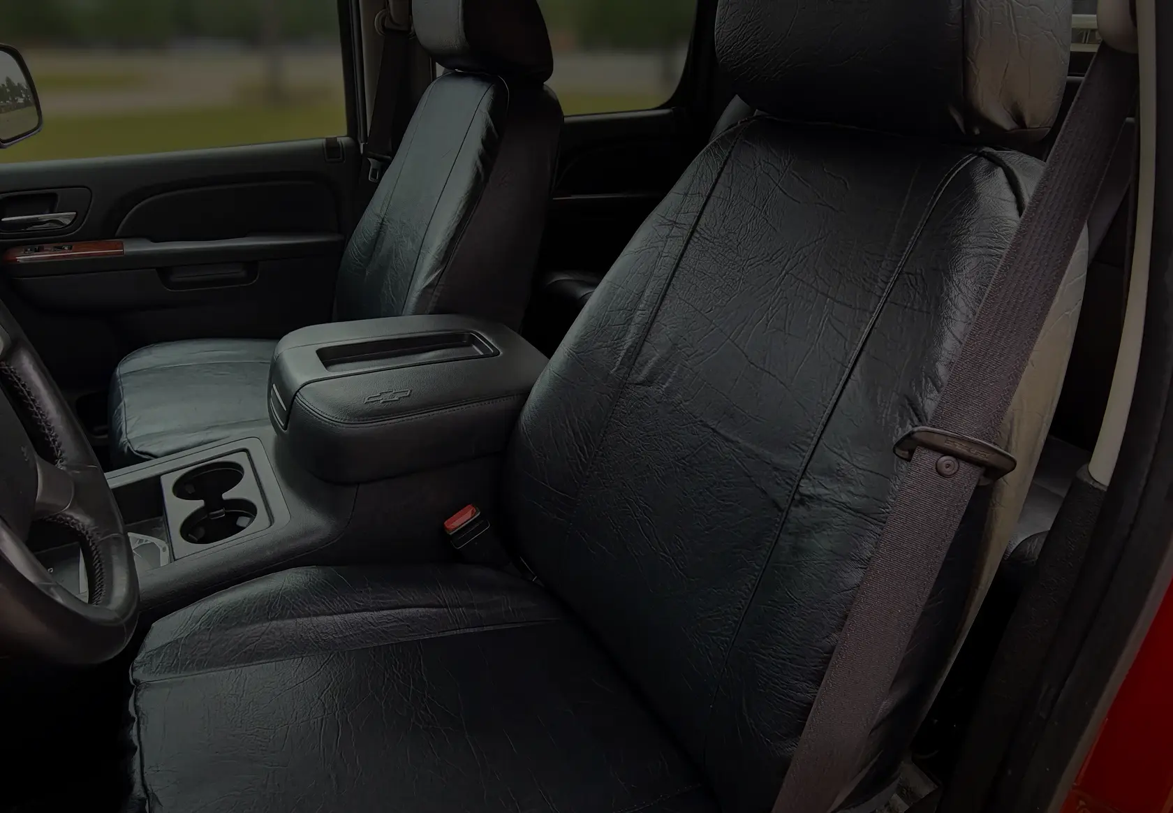
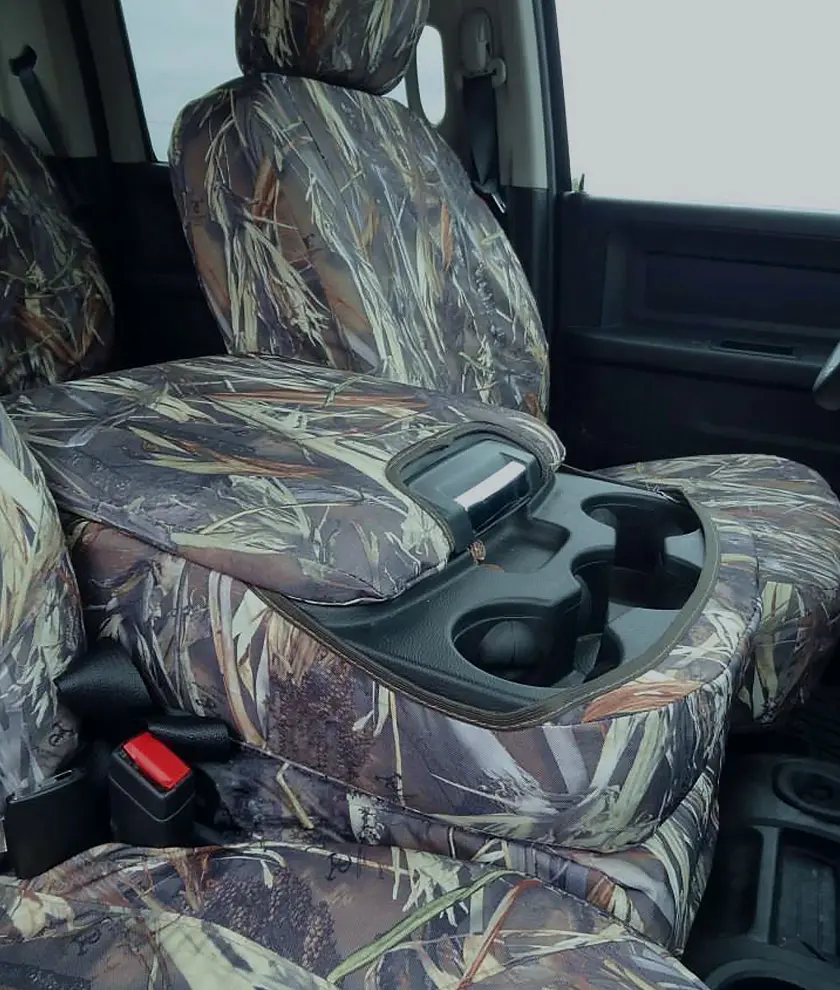
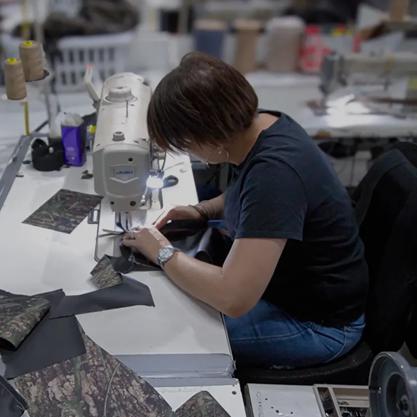
Durafit Seat Covers builds durable, precision-fit products for real-world use. Their website needed to reflect that same level of clarity and confidence. The objective was not a full redesign. The goal was to improve how users navigate, understand the product, and move into the purchase flow. We focused on the homepage and navigation to create a more direct, conversion-oriented experience.
The Challenge:
Durafit had strong products and steady traffic, but the homepage created friction.
- Messaging lacked a clear hierarchy
- Navigation slowed down product discovery
- Trust signals were not immediately visible
- The path to vehicle selection was not emphasized
- The overall styling and visual effects were outdated
- The UI elements and fonts departed from the client’s brand
Users had to interpret too much before taking action. That hesitation reduces conversions.
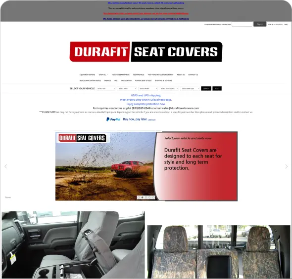
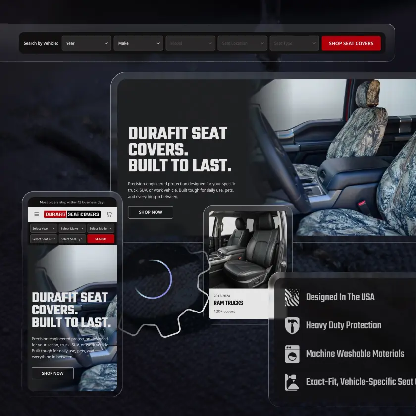
original
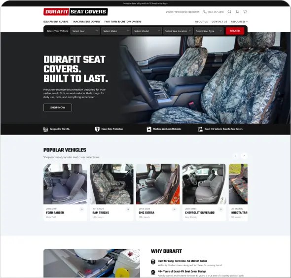
new
the strategy
We focused on the highest-impact areas: homepage structure and navigation.
The objective was to move users into the seat selection flow faster, with more clarity and confidence
The approach was built on three priorities:
Clarity
Make the value proposition obvious within seconds. Reduce cognitive load and remove unnecessary decisions.
Guidance
Structure the page to direct users toward the primary action. Prioritize the vehicle selection flow.
Trust
Surface credibility early. Reinforce durability, fit, and real-world use before users scroll.
Visual Authority
Elevate the overall visual design to align with the client’s professional brand. Use high-quality imagery, consistent styling, and refined layout to build confidence, strengthen perception of quality, and increase conversion.
execution
The project was completed in approximately two to three weeks from kickoff to launch.
By focusing on a defined scope, we were able to:
- Deliver quickly
- Control cost
- Improve a critical part of the funnel without disrupting the full site
This was a focused engagement, but each change was intentional.
- Redesigned homepage with a clear visual hierarchy
- Updated hero section with a direct, action-driven CTA
- Improved navigation to simplify product discovery
- Introduced trust signals earlier in the experience
- Recreated UI elements to elevate the brand to a top-tier standard
- Reorganized content to support fast scanning
- Optimized for mobile-first, task-driven users
a smarter approach to conversion
Not every brand needs a full redesign to improve performance.
In many cases, the most effective approach is to refine key surfaces that influence user behavior.
For Durafit, that meant improving the homepage and navigation. The result is a clearer path to action and a stronger first impression.
Key Takeaways:
- Clear hierarchy improves conversion
- Navigation should guide decisions, not slow them down
- Trust signals need to appear early
- Focused updates can outperform larger rebuilds
- Speed and clarity drive action
- Customized UI creation calls out the brand and builds trust
build what matters
Durafit needed a better experience, not a bigger project.
At Arctic Leaf, we focus on what drives results. That can mean a full platform build or a targeted UX/UI update that improves performance where it matters most.
If your site is underperforming but a full redesign is not the right move, we can help you identify and execute the changes that will.
Visit: durafitseatcovers.com


contact us
Ready to make a move? Drop us your info and we’ll get right on it.
Arctic Leaf Inc. needs the contact information you provide to us to contact you about our products and services. You may unsubscribe from these communications at anytime. For information on how to unsubscribe, as well as our privacy practices and commitment to protecting your privacy, check out our Privacy Policy.
Your partner in superior digital solutions.
- Copyright © 2026. Arctic Leaf Inc. All Rights Reserved.
- Privacy & Policy
- Terms & Conditions