The Importance of First Impressions in E-commerce Design
Key Takeaways:
-
Visitors judge your e-commerce site in 3-7 seconds, making first impressions critical to conversion success.
-
Clean layouts, high-quality images, and consistent branding build immediate trust and credibility.
-
Easy navigation and mobile responsiveness are non-negotiable for keeping potential customers engaged.
-
Fast loading speeds directly impact sales, with even 100-millisecond delays costing conversions.
-
Trust signals like security badges, reviews, and transparent policies reduce anxiety and encourage purchases.
From the initial concept to the official launch, after 6 months or more of hard work, your e-commerce website is finally live and facing your audience. However, the reality is harsh: in just 3-7 seconds, visitors will make their judgment on all that effort. Yes, a visitor's reaction to an e-commerce website is usually instant and emotional, shaped within that first moment. So beware: the first impression often becomes your e-commerce site's final judgment. Every potential customer who lands on your site is making split-second decisions about whether to stay or go.
Here's what happens during a customer's first look at your site, and how to make sure it works in your favor. A strong first impression can be the difference between a bounce and a conversion. Let's make love at first sight happen.
Understanding the User's Reaction to Your Website
When someone lands on your site, their brain is working overtime. They're not just passively looking at your homepage. They're processing, judging, and deciding whether to stay or leave. This happens in layers, almost simultaneously. Understanding these layers helps you design for them. Knowing your target audience makes this process even more effective. Here's what's going through your visitor's mind in those critical first seconds:
1. Immediate Visual Impression
Visitors subconsciously judge whether the site looks professional, modern, and trustworthy. When glancing at the homepage or landing page, if the design feels cluttered, outdated, or amateurish, their gut reaction is often skepticism: "Can I trust this site?"
If it looks sleek and high quality, with big sharp imagery, clear and readable typography, and icons and graphics that are consistent with the brand, the reaction is more positive. They think: "This looks like a brand I can shop with."
2. Emotional Response
Visiting a website is not just about collecting the visual impression. It's more like emotion delivery. The audience will feel confident and comfortable if the site feels familiar and easy to understand, which will lead them to stay naturally longer. Visitors feel excitement or curiosity if product images and headlines catch their attention right away.
On the contrary, when the homepage layout is messy, the copy is overwhelming, the navigation isn't obvious, confusion, hesitation, or even rejection may be raised in the audience's mind.
3. Expectation Check
Of course, your website is an online commercial platform, and your customers won't just be satisfied with its ideal visual effect or delightful emotional feel. It must meet their needs. In other words, even during these very short 7 seconds, shoppers are already checking if their expectations are met.
From the homepage, they're asking themselves: "Does the hero banner show the product I'm looking for?" "Can I find what I need?" "What are the main categories if I don't find an exact match?" "Where is the search bar?" "Does this site have testimonials or user-generated content?"
If the site makes these things clear up front, the reaction is typically positive. Even better, shoppers will remember your site and share it with their friends.
4. Trust Assessment
Visitors immediately scan for trust cues: secure connection (HTTPS), recognizable branding, product quality, and clear policies. These are factors you can't afford to ignore. If they're not visible early, the reaction may lean toward doubt or suspicion.
Key Aspects to Shape the User's First Impressions
Now that you understand what visitors are thinking, let's talk about what you can actually control. These are the design elements that directly influence those snap judgments. Master these fundamentals of e-commerce first impressions, and you're setting yourself up for success:
1. Visual Design & Aesthetics
Clean Layout, Clean Layout, Clean Layout. A modern, uncluttered design makes the site look trustworthy. Commercial UI/UX design is more like a focusing game. We get bombarded with digital information every second. Your job is to help your audience find calm and focus when they land on your webpage. Negative space, clean backgrounds, and high quality images create this breathing room for them. The homepage should never throw everything at your audience at once. Overly busy or outdated designs will drive visitors away. Every piece of content on your page should serve a clear purpose.
Branding Consistency: Use of brand colors, fonts, and imagery creates familiarity and professionalism.
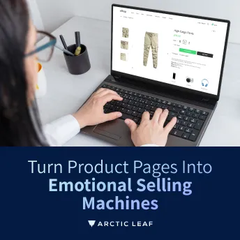
High-Quality Images: Sharp product photos and banners immediately build credibility.
2. Navigation & Usability
For most users, the navigation system is the most important user experience element on an e-commerce site. Easy navigation with a well-organized menu and search bar helps visitors quickly find what they want. Categories should be labeled clearly, not full of jargon. For example, "Men → Shoes → Sneakers" is straightforward, while "Collections → Lifestyle → Active Wear" might confuse.
Grouping items into familiar categories helps visitors feel oriented. People are more likely to stay when they immediately see where to click for what they need.
Prominent Search Bar: Many users go straight to search instead of browsing menus. A visible search bar that works with auto-suggestions and typo tolerance (e.g., "snikers" still shows "sneakers") keeps them from getting stuck. When the structure is clear: "This site is easy! I know where to go."
Ease of Use: Buttons, links, and filters should be intuitive. Calls-to-action (like "Add to Cart" or "Buy Now") must look clickable and be placed where users expect them. When usability is smooth: "This feels effortless! I can shop without frustration."
Mobile Responsiveness: Most users browse via phones, so a smooth mobile experience is non-negotiable. Pages should reflow neatly on different screen sizes. Text shouldn't be cut off, and images shouldn't require pinching to zoom. Buttons and links need enough spacing to be tapped easily with a thumb. Tiny links frustrate mobile users, and frustration kills sales. A poor mobile customer experience will send visitors straight to your competitors. When mobile experience is optimized: "This site feels smooth on my phone. I can shop comfortably here."
3. Loading Speed & Performance
Loading speed and performance aren't just technical details. They're the first silent conversation between your brand and the visitor. A fast site says, "We respect your time, you can trust us, and we're here to give you a smooth experience." That's the exact kind of first impression that makes users fall in love at first sight.
Amazon has long emphasized that even a 100-millisecond delay can cost a sale. Their obsession with speed isn't just technical. It's strategic.
Walmart reported that when they improved page load time by just 1 second, their conversion rates increased by 2%.
Shopify, as a platform, prioritizes fast, mobile-friendly templates. Many small-to-medium businesses use Shopify because it helps them create the same instant trust signals that big brands convey with speed.
Speed builds trust. When a site loads instantly, consumers subconsciously think: "This brand is legit." Speed creates delight through quick responses that feel enjoyable and rewarding, and speed drives sales. Faster performance doesn't just make people stay. It makes them buy.
4. Trust Signals
When a visitor lands on an e-commerce site for the first time, they immediately ask themselves: "Can I trust this store with my money and information?" Strong trust signals reassure them that the answer is yes.
Security Indicators are standard. A secure site (with "https://" and a padlock icon) is now a baseline expectation. If it's missing, users often leave instantly, fearing scams or data theft. Payment Security Badges certifications give shoppers reassurance during checkout. The visibility of these security features communicates: "Your payment is safe here."
Social proof tells the visitor, "Other people trust this store, and you can too." Positive ratings and reviews create immediate credibility. Photos from real customers using the products build authenticity and relatability. Social media mentions and testimonials further reinforce your credibility.
Another key factor is Transparency! Easy-to-find return policies, shipping information, and contact details foster trust. Clear, accessible content about your policies shows you have nothing to hide.
Trust signals are like a warm handshake the moment a visitor arrives. They reduce anxiety, replace doubt with confidence, and create the foundation for an emotional connection. When shoppers feel safe, they're more likely to stay, explore, and eventually fall in love with the brand.
Things to Avoid
Love at first sight in e-commerce design closely mirrors the dynamics of human relationships. We're here to help you build a successful online business. However, just like with people, emotions and reactions can be unpredictable. To close out this article, here are the key takeaways to help you avoid creating a "hate at first sight" experience.
The most common website design mistakes that hurt first impressions on e-commerce websites and push visitors away:
1. Cluttered or Overloaded Layout
Too many banners, pop-ups, or ads appear immediately. Overwhelming visitors with product categories or promotions at once. Lack of white space makes the site feel cramped and stressful.
2. Slow Loading Speed
Heavy graphics, unoptimized images, or poorly coded scripts. Delays frustrate users and make them lose trust in the brand.
3. Unclear Navigation
Menus with too many items or poor categorization. Hidden or hard-to-find search bar. No clear path to key pages like "Shop," "Cart," or "Contact."
4. Poor Mobile Experience
Non-responsive design that doesn't adapt to smaller screens. Buttons too small to tap. Check out forms that are hard to fill out on mobile.
5. Weak or Distracting Branding
Generic stock photos instead of unique product visuals. Inconsistent use of fonts, colors, or styles. No clear value proposition in the first screen ("Why buy from us?").
6. Lack of Trust Signals
No visible security indicators (HTTPS, payment badges). Missing or hidden return/refund policies. No customer reviews or testimonials.
7. Confusing or Weak Calls-to-Action (CTAs)
CTAs are hidden in the page clutter. Buttons that don't stand out visually. Vague wording like "Click here" instead of "Add to Cart" or "Shop Now."
8. Autoplay Annoyances
Loud autoplay videos or music. Pop-ups that appear before the user even sees the homepage. Chatbots are opening aggressively without user interaction.
9. Low-Quality or Inconsistent Images
Pixelated, mismatched, or stretched product photos. No multiple-angle views of products. Lifestyle/product context missing (only bland catalog shots).
10. Complicated Checkout
Too many steps before purchase. Forced account creation before checkout. Hidden fees or shipping costs are revealed only at the last step.
The Bottom Line
You spent months building your e-commerce site. Don't lose customers in the first seven seconds because of fixable design mistakes. Your visitors won't give you a second chance if the first impression fails. They'll leave and find a competitor who gets it right.
You now know what shapes those critical first impressions: clean design, fast loading, intuitive navigation, mobile optimization, and visible trust signals. These are the foundation of a site that converts.
Start by auditing your homepage right now. Is it cluttered? Does it load fast? Can users find what they need in seconds? Be honest about what's broken, then fix it. Your customers will reward you with their trust, their time, and their purchases. Make a lasting impression, and you'll build relationships with customers who come back again and again.